

Kate's Cancer and the Vaccine, Part II
Slight change in programming to add a Part as described below.

[Note: This one is 16 days late because I kept getting a message “Network error try again in a bit” for 16 days. I contacted substack. I did everything they told me to do. but nothing changed. Please accept my sincere apology. Sorry!]
The slight change is, I want to analyze the data pointing toward what everyone is worried about; the increase in cancer incidence and so-called Turbo Cancers. Are they real and if so, are they related to the vaccines?
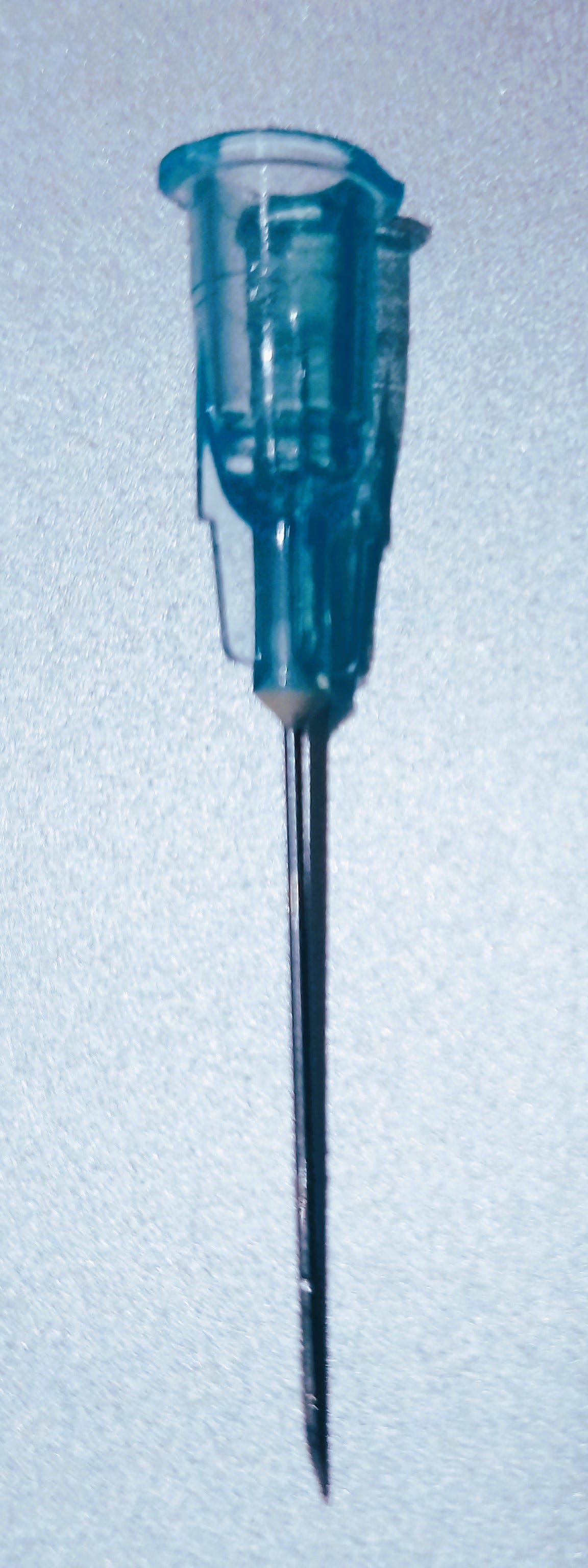

But first! Looking at this picture again, I don’t think Kate is actually getting an injection here. That’s a 23 gauge needle he’s using. I can tell by the blue color of the hub. First of all, he should be using something skinnier- a 27 gauge at least. A 23 ga is much too large a caliber.
The picture shows he’s got it inserted as far as it will go. Given that the needle part of a 23 gauge needle is about an inch long, with Kate having only a film of sub-q fat, that needle would be going all the way through her deltoid and into the bone (her humerus). Ouch!
I think this photo was just for show. They snapped off the needle part and put the hub against her skin. She got her shot quite possibly the same day, but most likely not while this picture was being taken. They wouldn’t risk her fainting “in public”. It’s very rare but sometimes people faint when getting shots.
OK, let’s get on to the data regarding the incidence of cancer before and since the vaccine rollout occurred on December 14, 2020.
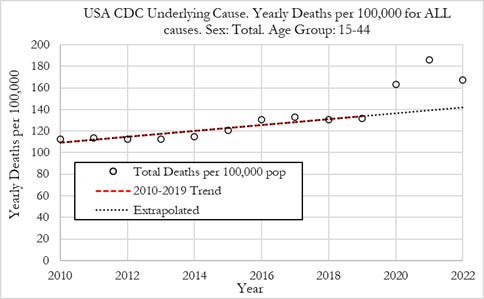
A paper came out recently showing the increase in all cause deaths over the average per year expected, based on a 9 year trend, per 100,000 population. In 2019, there were 130 deaths per 100,000 people. That was in line with expectations. In 2020, there were 160 deaths, a 19% increase above expected, in 2021, a 32% increase, and in 2022, an 18% increase. These are ENORMOUS increases as these things go.
Did something explode onto the scene in 2020 that caused those enormous increases in all-cause in deaths?
This data is from the CDC. It’s always good to use data compiled by a liberal source when making a point liberals will dislike and the same goes for conservatives. In this case the liberals can’t say, “You’re using fudged data from some right wing source”. (You will recall that when I proved statistically that the 2020 Presidential election was stolen, I used data from the far-left New York Times. No one could complain that I used fudged figures to prove Trump won. It’s the same thing here. I’m using CDC data to indict the CDC! Sure, I’m a conservative person, but when I do these analyses, political ideology goes out the window. I can’t afford to even hope one side wins over the other because that could bias my interpretation. I HAVE TO BE RIGHT OR I BLOW MY CREDIBILITY. If the data show that the left-leaning interpretation is correct, I will explain why that side is correct. Same for the right. Data analysts who are trying to score political points are going to be wrong sometimes.
Thanks for that and let’s get back to it.
Look at the last 10 years. Again, we see enormous increases in all cause mortality in 2020, 2021, and 2022. In order to determine if the vaccines caused the increases in 2021 and 2022, you have to explain how 2020 could have happened because the vaccines came out too late in that year to have accounted for the large rise we saw that year. The rollout dates were December 8, 2020 in the UK, December 14, 2020 in the U.S. and December 20, 2020 in Israel which I happen to know because I used Israeli data to prove the vaccines weren’t protecting recipients from getting the disease and weren’t blocking transmission. I proved it on January 15, 2021, only 26 days after their rollout. All the data jocks and epidemiologists including Dr. Bhattacharya said, “No way you could have figured it out that fast!” I asked them, “Did you use calculus? Did you take Immunity-in-Place into consideration in light of rollout demographics?
Their answers were, “No” and “What?”
I wish more people had seen that post. It was interesting how I did it but YouTube didn’t care. They knew it would result in fewer people taking the poison injection. My video didn’t last even 5 minutes.
There are many reasons why all-cause mortality went up in 2020. Some of it is due to Covid, sure. I’ll go over some of those reasons shortly but I want to look at excess cancer deaths compared to 2010 - 2019 using analogous x and y axes.
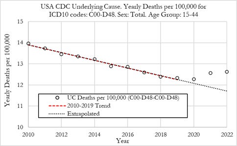

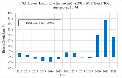
Just as I suspected, the “fall off” in 2022 you see in the all cause (blue bar) above is not there in the graph of deaths due to cancer (red bar). In other words, 2022 was milder as far as all-cause mortality goes but worse as far as deaths from cancer goes.
Looking at all the graphs,
There’s a upward trend, from 2010 to 2019, in all-cause mortality at the same time there is a (more pronounced) downward trend in deaths due to cancer in that time period. That is shocking. I thought all cause deaths were dropping. This could be due to the large “bump” of baby boomers making its way through time. But since cancers tend to happen in older people, this would not explain why cancer deaths were dropping so steeply until the SARS-2 virus was released and the counter-productive policies were put in place, ostensibly, to curtail it.
There’s a small increase in cancer deaths in 2020 so, that year, the huge increase in all-cause deaths was due to something else. I’ll explain where it came from shortly.
In three of the 2010 - 2019 years, the number of excess cancer deaths was negative, showing there was a decrease in cancers those years. So cancer deaths have truly exploded since 2021 in particular (with a little explosion in 2020 i.e. the excess deaths due to cancer are low in 2020 compared to 2021 and 2022 but they are significantly higher than the previous years 10 years.)
I think I can explain all of this.
First the huge increases in all-cause deaths in 2020:
It turned out Covid killed at most 60,000 people in the U.S. during 2020, 2021, and 2022; not the 1.2 million claimed by Johns Hopkins, the CDC, the FDA, the WHO, and the U.S. Government. I know it’s hard to believe. I’ve written extensively on this and posted an audio two days age, explaining this. You’ve got to look at the old post (from November, 2023) or listen to the audio to stay with me.
Most properly-assigned deaths from Covid occurred in 2020 during the ascending part of the northeast’s Gompertz curve. The overwhelming majority of true Covid deaths occurred here too; perhaps 2/3’s of the total; let’s call it 33,000. or 1% of the total deaths that year, which was about about 3.3 million. So Covid accounts for one percent of the 19% of excess deaths (the left-most tall blue bar in the three that tower over the others). If it had been depicted in the red and blue histogram in another color, say, green, its green bar would have been half as high as the red one.
Cancer appears to account for 2 of the 19%. Where did the other 16% come from? The people pushing the government Narrative attribute them to Covid but that’s wrong. I’ve already proved that.
So where did the lion’s share of the 2020 all-cause deaths come from? It appears they resulted from people’s reaction to the fear propaganda (such as the “falling man” videos put out by China and the lies told by US TV doctors), the lockdowns, and the moratoria placed on all but emergency surgery . Take a look at these sobering statistics from 2020:
*One million patients are undergoing chemotherapy at any given time in the US. Up to 1/2 stopped their treatment because they feared catching Covid at the facility where the treatment was administered.
*2/3’s to 3/4’s of cancer screenings were not done.
* 40 - 50% of patients having heart attacks did not call an ambulance
Note: These trends were not as pronounced in 2021 and 2022 since the “fear hysteria” had waned somewhat.
The three tall blue bars were not due to Covid exclusively in any year as the Narrative supporters would claim. A tiny percent were due to deaths from Covid; 1% in 2020 and much smaller percents in 2021 and 2022. They were due to other things and those things were not the same in 2020 as they appear to be for 2021 and 2022.
2020 first:
In 2020, about 1% of the increase over expected all-cause mortality was due to Covid, 2% was due to increases in cancer mortality and 16 % were residua from non-pharmaceutical interventions put in place by our government to combat Covid and the lying that induced fear in our population. Because of lockdowns and moratoria placed on all but emergency surgeries, people did not go in for cancer screenings, tumor biopsies and excisions, chemotherapy and the like in massive numbers.

All of this could easily account for the 2% increase in cancer deaths in 2020. It explains the 16% also. As many as half of the patients experiencing chest pain did not call an ambulance to take them to the hospital for fear of catching Covid. Cardiologist appointments where diabetes and high blood pressure are diagnosed and managed were missed leading to deaths from strokes and heart attacks. Cardiac deaths increased in 2020, 2021 and 2022 after years of decreases. In 2020, they were most likely due to patients not using medical treatments, facilities, and expertise due to fear of catching Covid.
2021 and 2022:
Cardiac deaths increased in these years most likely due to the vaccine because the reasons for increases in 2020 such as fear of going to the hospital or a physician’s clinic no longer applied.
Possible explanations for increased cancer incidence and death include vaccine-related as below and those of 2020 such as delayed screening, diagnosis and treatment. (My apologies for this list being technical.)
Shift to IgG4 which blocks IgG1 & IgG3 from the Fc receptors on NK cells and macrophages. Shift to IgG4 occurs after two vaccine doses.
Spike proteins interfere with DNA repair
Spike proteins interfere with tumor suppressor proteins such as BRCA-1
Pseudouridine in modRNA attenuates the activity of Toll-Like Receptors on cells of the innate immune system (resulting in damaged signaling, etc.)
ModRNA and/or plasmid DNA contamination In vaccine vials containing code for the spike protein incorporation into our genomes
SV-40 promoter found in DNA plasmid contaminants being incorporated in the wrong place in our DNA resulting in the activation of oncogenes.
To summarize, the majority of the increases in all-cause mortality in 2020 were most likely due to lockdowns and fear causing delayed screening, diagnosis and treatment of a number of conditions which resulted in death. Conditions included cardiac-related, kidney failure, stroke, and cancer.
2021 and 2022 increases in all-cause mortality were most likely due to delayed screening, diagnosis, and treatment occurring in 2020 and vaccine-related cardiac deaths, deaths due to strokes, kidney failure and much greater deaths due to cancer.
2020 deaths due to cancer were lockdown and fear related. Massive numbers of patients stopped chemotherapy and were not able to get the surgery they needed to prolong their lives.
2021 and 2022 deaths due to cancer include delayed screening, diagnosis and treatment such as chemotherapy and/or surgery in 2020 and vaccine-related, possibly through one or more of the processes 1. - 6. above. Note: I don’t think Kate would be subject to delays in screening, diagnosis and treatment. Her diagnosis would be much more likely to be vaccine-related than the typical new cancer diagnosis.
In Part III, we will look, with respect, at the different types of abdominal cancer Kate may have gotten and what her prognosis might be.
Great work Dr. Sheftall! Thank-you
I suspect her cancer is ovarian that spread to her bowel. The spike protein was designed to concentrate itself in her ovaries as pfizers documents revealed that a judge forced Pfizer to release instead of keeping this hidden for 75 years ...
Dr Reid, thanks for posting, glad your substack is behaving again. On my end, so far so good but a few glitches last month.
Can you, or did you repost your January 2021 video on another platform such as bitchute, odysee, or rumble?
Also, re 2020 deaths. I don't have any numbers, but from hearing stories it seems to me that many people, both young and old, could not handle the isolation and fell into suicidal depression. Plus staying alone all day inside for weeks and weeks on end was nothing good for anyone's immune system.